Stop averaging your GCP percentiles in Datadog
I’ve come across this issue professionally more than a few times now, and decided to write it down. A lot of latency graphs are unusable. Observability is hard, and talking about performance is even harder. But it is made a lot harder than needed by the platforms built for this, than it should. This article is for everyone creating dashboards, especially when you use DataDog & GCP together.
Stop averaging your GCP percentiles in Datadog
If you pull Google Cloud metrics into Datadog, there’s a good chance one of your latency graphs is lying to you. Here’s the query almost everyone writes:
avg:gcp.loadbalancing.https.total_latencies.p95{project_id:my-project}
It looks reasonable. It’s the default Datadog hands you when you click the metric. And it is quietly, structurally wrong. Not “slightly imprecise” wrong — reaggregating-something-that-cannot-be-reaggregated wrong. This post is my attempt to explain why once, so I can link it instead of re-explaining it, and to point Datadog and Google at the part of the pipeline that makes this the path of least resistance.
You cannot average percentiles
This is the whole argument, and it’s not a Datadog problem in origin — it’s arithmetic.
A percentile is a rank statistic over a specific population. The p95 of backend A and the p95 of backend B each describe their own distribution. Averaging them:
avg(p95_A, p95_B) ≠ p95(A ∪ B)
There’s no weighting, no correction, no aggregator that recovers the true combined p95 from two precomputed p95 scalars. The information needed to compute it — the shape of the underlying distributions — is already gone by the time you have two numbers. You threw it away when you reduced each slice to a single percentile.
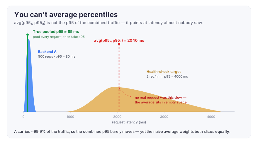
Concretely: a busy backend serving 500 req/s at a healthy 80 ms p95, and an idle health-check target serving 2 req/min that occasionally records a 4-second p95, get equal weight in that avg:. Your graph shows ~2 s and you go hunting for a regression that doesn’t exist. The signal you care about — the p95 your actual users experience — is buried under a slice that barely has users.
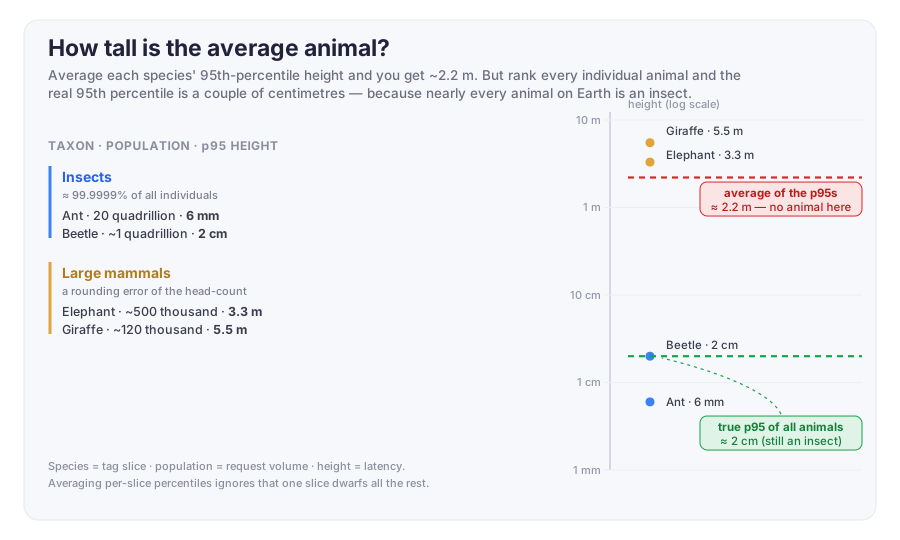
Analogy from the physical world to make it clearer:
Why the integration makes this the default
Here’s the part worth understanding, because it’s where the fix has to happen.
In Cloud Monitoring, loadbalancing.googleapis.com/https/total_latencies is a distribution metric. Google keeps the histogram — the buckets — server-side. That’s the good data; from buckets you can compute a correct global percentile across any set of slices.
But the Datadog GCP integration doesn’t ingest the buckets. It polls the Monitoring API, asks for reduced scalar aggregations, and lands them in Datadog as ordinary gauges: one …total_latencies.p95 time series per unique tag combination (region × response_code × backend_name × …). So what you have in Datadog is not a distribution. It’s a hundred-plus independent scalars, each one a frozen percentile of a slice you can no longer decompose.
Once the data is scalar percentiles, every cross-slice operation is invalid. avg: is the obvious offender, but there is no correct alternative aggregator either, because the primitive is wrong, not the aggregation.
I understand why the integration does it this way — pulling reduced scalars matches the Monitoring API’s aligner/reducer output and is far cheaper than pulling full bucket histograms per series per interval. It’s a defensible engineering tradeoff. It’s just one that silently hands users a metric that can’t be aggregated, wired up to a UI that invites them to aggregate it.
The bonus symptom: flaky graphs
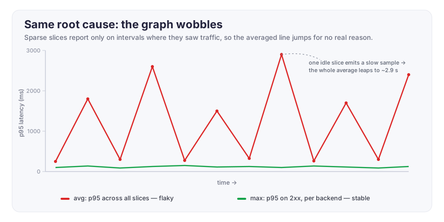
Same root cause, second face. Low-traffic slices only emit on intervals where they saw a request. So at any given rollup, the set of series feeding your avg: shifts — sparse slices blink in and out. Your line wobbles not because latency changed but because the denominator of an average you shouldn’t be computing keeps changing. Interpolation and .fill() can paper over the gaps, but you’re smoothing a number that was never meaningful.
The workarounds, and where each one breaks
I went through these so you don’t have to.
Group instead of average. Query by {backend_target_name,etc} so each line is one slice’s genuine p95 — no cross-slice math. This is correct, and it’s what you actually want to look at. But if you group by the noisy tags too, you get 100+ lines and a graph nobody can read. Keep the grouping to the one dimension you reason about and cap it with top(…, 10, 'mean', 'desc'). Correct, but it’s several lines, not one number. This does not scale if you have tens of tags, and hunderths of tag values.
Use max: instead of avg:. max:…p95{…, response_code_class:2xx} gives the worst real p95 across all slices. Honest, monotonic, good for “is anything bad.” Filter to successful requests — timeouts belong to your error-rate SLI, not your latency SLI, and letting them in makes max needlessly pessimistic. Still: it’s the worst slice, not the aggregate, and it can be dominated by a low-traffic slice with one slow request.
Count-weighted mean. sum(p95_i · count_i) / sum(count_i), using request_count on the same tags. It kills the tiny-slice-dominates skew, and Datadog’s formula engine can technically build it. But it’s fiddly to construct and maintain, and — this matters — a count-weighted mean of percentiles is still not a percentile. You’ve traded an obviously-wrong number for a plausibly-wrong one. I wouldn’t ship it.
Notice the pattern: every fix is either not-one-number, not-the-aggregate, or not-actually-a-percentile. When none of the cheap options land cleanly, that’s the tell — the scalar percentile gauge is the wrong primitive, and no query on top of it will be right.
The actual fix: keep it a distribution
Get the raw distribution into Datadog and let it stay a distribution.
Datadog’s native distribution type stores data as DDSketches and reaggregates correctly server-side — that’s the entire point of it. With a real distribution, avg:…p95{…} merges the sketches and gives you one correct global p95 across whatever tags you keep. One line. No sea of lines, no max pessimism, no manual weighting. All three workaround compromises vanish at once, because reaggregating a distribution is valid where reaggregating a scalar percentile never was.
Two ways to get there:
- OpenTelemetry Collector. Pull the LB metric via the
googlecloudmonitoringreceiver as an exponential histogram and export OTLP to Datadog. OTLP histograms map to Datadog distributions by default. You get accurate percentiles for any tag combination without touching app code. - Instrument at the application. Emit latency as a Datadog distribution (DogStatsD distribution, or an OTel histogram from the service). This is the robust route if you’re on Cloud Run or similar, and it’s where teams that hit this wall tend to end up.
What Datadog and Google could do
I’d rather this not be everyone’s homework, so, concretely:
- Datadog: the GCP integration already knows how to turn OTLP histograms into native distributions. Do the same for Cloud Monitoring distribution-typed metrics — ingest the buckets, store a distribution, expose real percentile aggregators. Failing that, at minimum stop defaulting distribution-derived percentile gauges to
avg:space aggregation, and surface a warning that cross-slice aggregation of these series is not meaningful. - Google: the buckets exist in Monitoring; the export path that hands partners reduced scalars is where the fidelity is lost. Making the distribution’s buckets cleanly consumable by downstream integrations would let every observability vendor do this right.
Until one of those happens: look at grouped per-backend p95s, use max on 2xx traffic as your “is anything on fire” signal, and treat the single averaged line for what it is — a plausible-looking number that isn’t measuring anything.
Percentiles don’t average. Design your pipeline so you never have to pretend they do.